
Background and History of Art Form
- Year of publication for artwork: 1633
- Genre/Style: Still Life Baroque
- Media/Medium: Oil on Canvas
- Dimension: 62.2 cm × 107 cm (23.6 in × 42.1 in)
- Location of Display: Norton Simon Museum, Pasadena, CA, US
Background and History of Artist
- Full Name/Recognized Name: Francisco de Zurbaran
- Nationality: Spanish
- Born Date of Artist: 7th November 1598
- Death Date of Artist: 27th August 1664
- Movement: Baroque
Brief Overview/History of the Artwork
- The painting shows three groups of objects (a saucer of four citrons, a basket of oranges, and a saucer holding both a cup of water and a rose) resting on a table against a dark background.
- Objects are placed equidistant from one another and form a spatial and geometrical balance due to their pyramidal organization.
- Andreas Prater (German art historian) commented on the painting’s composition by saying, “Against the dark background, the objects are completely static, and appear to be torn out of the context of everyday life.”
- Zurbaran’s works contained Christian themes so the objects in the painting are often interpreted as having symbolic meaning as alluding to the Holy Trinity or as an homage to the Virgin Mary.
Analysis of the Colors/Theme
Due to the limited colors that were used by Zurbaran in this painting, I decided to focus on the four most prominent colors of the palettes by excluding the brown, silver, and white colors of the cup and table. Let’s start with:
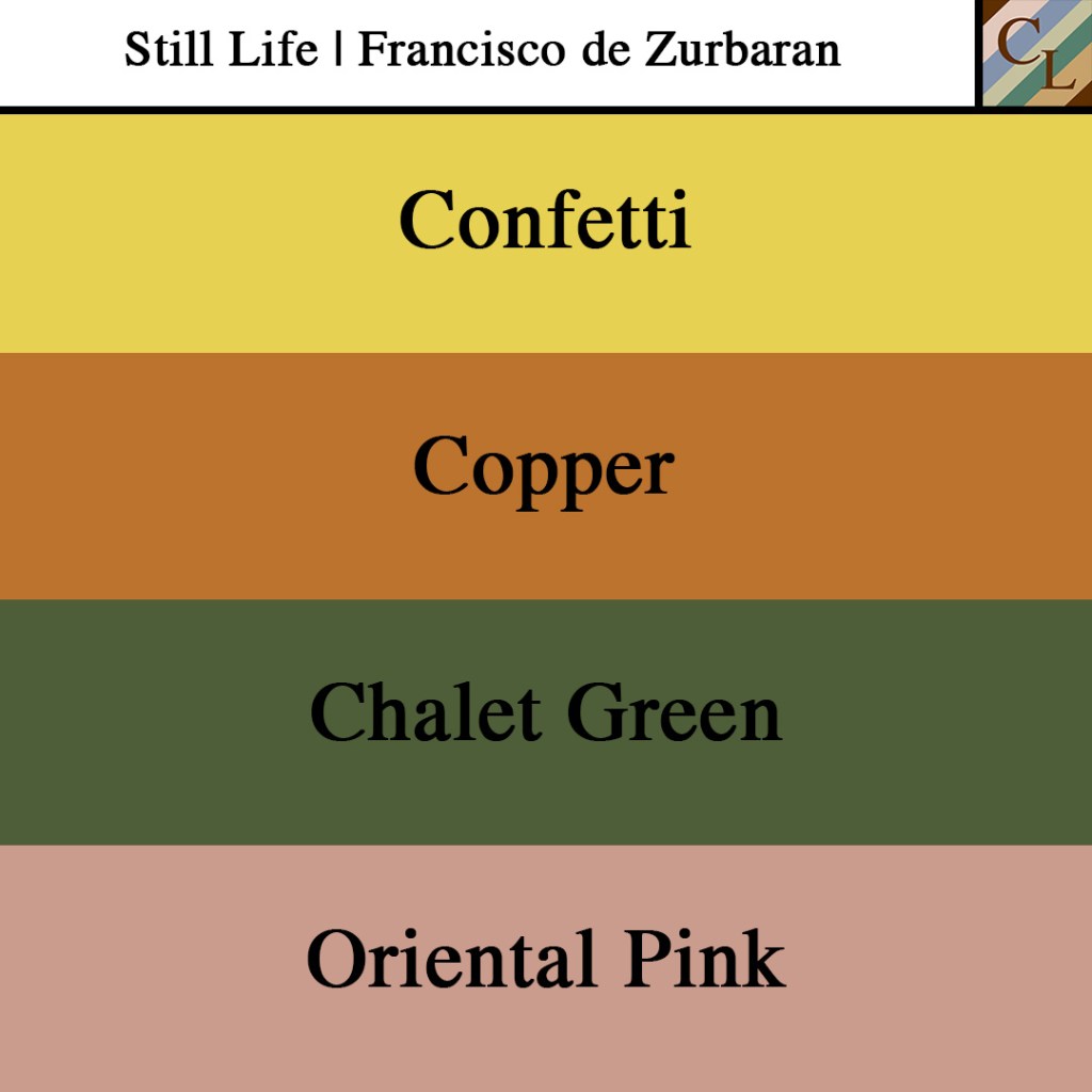
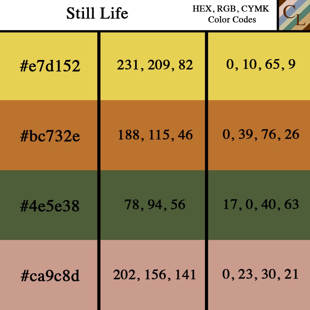
Confetti represents the lemons on the silver plate. Though the colors were pulled in a digital form, the creaminess of the yellow is much appreciated. As we know baroque style of art highlights movement, contrast, and deep color. The lightness of this yellow contrasts with the dark background of the painting and the brown table while blending well with the lightness of the other colors presented in the painting. The shade of Confetti also serves as a perfect eye transition to the basket of the oranges because of the contrast of hues which takes your eyes over to the color of the oranges.
Copper represents the oranges shown in the middle of the painting. This is a good shade of orange chosen for the style and theme of the artwork and I appreciate the dark side of the oranges as well. I have to acknowledge the basket on which the oranges are placed because it serves as a perfect balance between the 80% of the painting in which the lemons and oranges lie.
Chalet Green is shown in the leaves above the oranges. Without the Chalet green, the color palettes of the entire piece would be warm and with the darkness. Of the background and the table, I believe that Zurbaran did not envision a warm palette for the piece. Adding the green to the painting softens the palettes by making it a mixed palette and bringing more life to the piece. Believe it or not, the green balances the entire piece when you look at its color symbolism and composition, and its geometrical alignment.
Oriental Pink is shown in the rose next to the teacup. When you cut off 80% of the painting that does not encompass the lemons and oranges, the pink of the painting delivers a dainty and pure feeling connected to it. The subtleness and limited use of pink do the painting justice by completing the entire piece with only a slight subconscious (or conscious) acknowledgment of the unity of the color scheme.
Personal Viewpoint on the Artwork.
Overall, Zurbaran did a beautiful job working on this masterpiece and I see why it deserves a permanent placement to be displayed at the Norton Simon Museum. The color composition and the geometrical alignment of the piece are some of my favorite aspects of the painting, but personally, I am fascinated by the use of the color wheel by Zurbaran. Without thinking about it too hard, Zurbaran created a real-life representation in this still painting with the use of a warm color palette (incorporating yellow, oranges, and pink). With the use of a green geometrically set in the center, the palette becomes a mixed palette that delivers a feeling of movement due to the contrast presented by the colors.
References
https://www.wikiart.org/en/francisco-de-zurbaran/still-life-1633
https://www.wikiart.org/en/francisco-de-zurbaran
https://en.wikipedia.org/wiki/Still_Life_with_Lemons,_Oranges_and_a_Rose
https://en.wikipedia.org/wiki/Francisco_de_Zurbar%C3%A1n
Next in Set A: The Embarkation of the Queen of Sheba | Claude Lorrain (1648)

Leave a comment