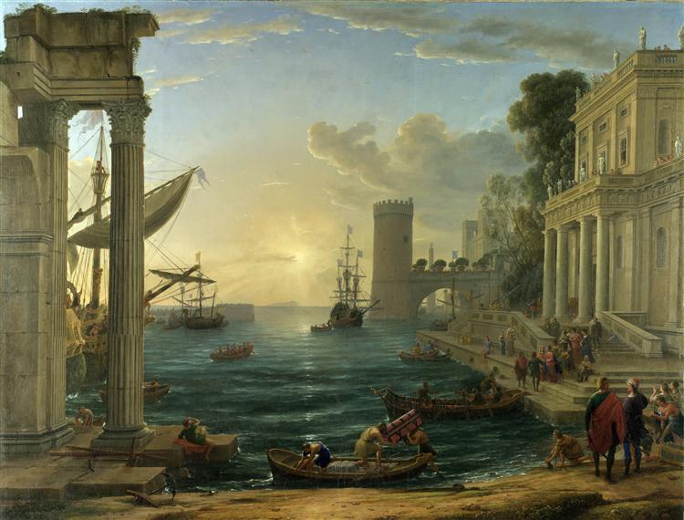
Background and History of Art Form
- Year of publication for artwork: 1648
- Genre/Style: Cityscape Classicism
- Media/Medium: Oil on Canvas
- Dimension: 149 x 194 cm (59.1 in x 76.4 in)
- Location of Display: National Gallery, London, UK.
Background and History of Artist
- Full Name/Recognized Name: Claude Lorrain (French)
- Born Date of Artist: c. 1600
- Death Date of Artist: 21st November 1682
- Movement: Baroque
Brief Overview/History of the Artwork
- Depicts the departure of the Queen of Sheba to visit to King Solomon in Jerusalem, described in the tenth chapter of the First Book of Kings.
- The Queen is departing from a city with classical buildings, with the early morning sun lighting the sea, as vessels are loaded.
- The composition draws the eye to a group of people on the steps to the right, at the intersection of a line of perspective (the steps) and a strong vertical (the left column of the building’s portico).
- The Queen wears a pink tunic, royal blue cloak, and golden crown, and is about to board a waiting launch to take her to her ship – perhaps the ship partially concealed by the pillars to the left, or the one further out to sea, over the picture’s vanishing point.
- The painting was one of the first works to be acquired by the National Gallery in 1824.
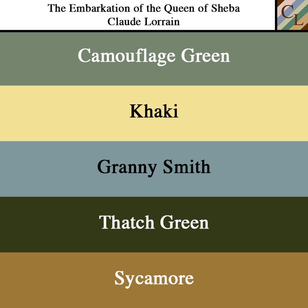
Analysis of the Colors/Theme
When studying this artwork, I decided not to focus on an image or the concept itself but moreover the composition or placement of the structures within the painting itself. As we know, the figures within the artwork depict the embarkment of Queen Sheba, but the pillars, buildings, the ground, and natural landscape support the story by using colors. Let’s take a look:
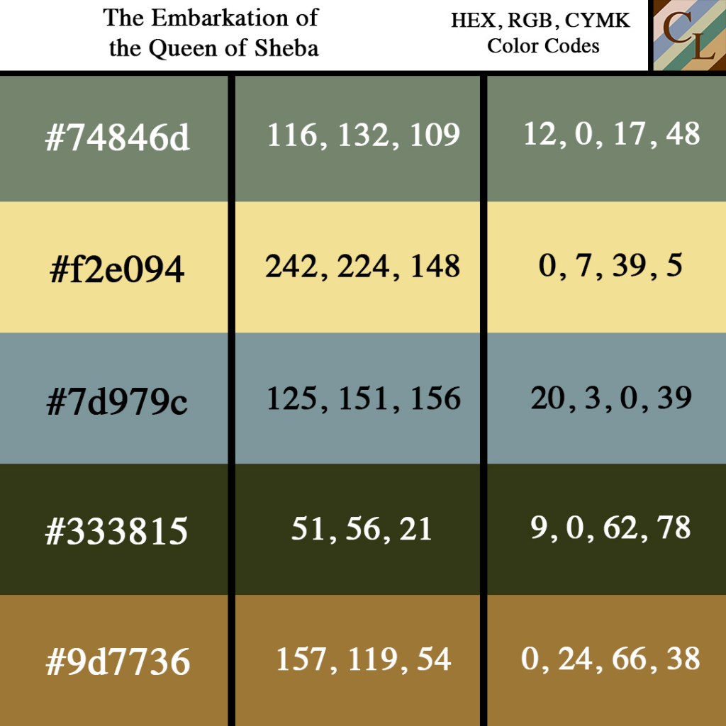
Now, you may be thinking that Camouflage is shown within the trees, but in reality, the color camouflage is shown within the deepness of the water. This choice of blueish green is true to the color of the seas, seeing that this is not connected to an ocean but more of an inlet that is connected to the ocean. This green serves as a contrasting balance to the blue that she sees in the sky and the darker green that we see in the trees, making a triangular scheme of cool yet dull contrasting colors. It is fitting as well considering that its name is Camouflage and the green hides behind the idea of water always having to be blue.
With our Khaki, it is represented by the sun and the light that surrounds it. When selecting the color that I wanted to represent the sun, I knew the palette was going to be dull so going with a dull yellow would work well to represent the sun and its surround area. Khaki serves as the center focal point when it comes to the colors of the painting because as the shine shines, it radiates to the blues, greens, and browns.
Granny Smith is the color shown within the sky. As we move from our color center point which is Khaki and gravitate upwards we are welcomed to the color of the sky which happens to be this dull Granny Smith. It works well for the painting because it gives the illusion that because the sky is blue the water would be blue as well, but the water has those green undertones that were mentioned earlier. Having this dull blue to match against a dull blueish green was a smart move on Larrain’s part as an artist because it sets a barrier around the upper and bottom portions of the sun.
Next up is the Thatch Green which comes from the trees, this is the last color to be revealed in the trinity colors that is within the color palette. When compared to the dull lightness of the sky and the deepness of the camouflage waters, this green serves as a bridge between the colors on the top and bottom portions of the painting. In addition to the water, thatch green is another indicator of the location in the painting, considering that the water’s color is a real representation of the Nile. Not much could be said about Thatch Green apart from the fact that it is the closest color to nature and shows the fruitfulness of the Nile River.
Last in our quintet of colors is a nice Sycamore brown that is represented in the desert sand that encompasses the Nile. The color of this brown at the bottom of the painting bounces off the building and pillars on the left and right of the painting as if completes the borders all around the opiating except for the top portion. Considering that brown is also a color that represents the foundation and being grounded, it serves well-being at the bottom of the painting as it grounds the other colors that surround it.
Personal Viewpoint on the Artwork.
In the end, once Queen Sheba departs on her journey, these colors will leave and go with her. The Queen will be seeing those Camouflage blue waters and Granny Smith skies as she embarks on her adventure to visit King Solomon. Ultimately, the greens take control in this color palette, showcasing the lusciousness of the Nile River and the trees that direct you to the story that is being told of Queen Sheba’s embark. Khaki holds true to the center of the painting while Sycamore does a great job keeping everything grounded as Lorrain paints the story being told.
References
https://www.wikiart.org/en/claude-lorrain/the-embarkation-of-the-queen-of-sheba-1648
https://www.wikiart.org/en/claude-lorrain
https://en.wikipedia.org/wiki/The_Embarkation_of_the_Queen_of_Sheba
Next in Set A: Madame de Pompadour | Francois Boucher (1756)

Leave a comment