Background and History of Art Form
- Year of publication for artwork: 1871
- Genre/Style: Cityscape Impressionism
- Media/Medium: Oil on Canvas
- Dimension: 45.7 cm × 67 cm (18.0 in × 26 in)
- Location of Display: Metropolitan Museum of Art, New York
Background and History of Artist
- Full Name/Recognized Name: Claude Monet
- Born Date of Artist: 14th November 1840
- Death Date of Artist: 5th December 1926
- Movement: Impressionism
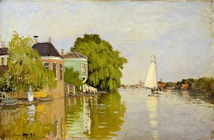
Brief Overview/History of the Artwork
- Painted during his sojourn in the Netherlands in 1871, near the village of Zaandam.
- The Achterzaan river occupies the foreground of the painting while windmills and industrial buildings can be seen in the distant background.
- The water reflects the multi-colored houses and willow trees that line the riverbank as well as a white sail boat that floats along the water.
- A woman dressed in a white diaphanous gown stands beneath a willow tree on the left, gazing by the water.
- Evokes a sense of leisure and pastoral beauty typical of Dutch seventeenth century paintings.
Notes on Color
- Employing a distinctly blonde color palette reminiscent of that used by landscape painter Corot, Monet renders this scene with attention to atmospheric detail and palpable light
- The artist’s color palette, portrayal of leisurely pursuits, and increasing attention to the surface of the canvas were significant and influential in the development of his increasingly modern approach to painting.

Analysis of the Colors/Theme
Taking into account that Monet used a blonde color palette for this painting, I think my selection of the colors complements what he was aiming for and when we think of a blonde palette, we don’t mean directly blonde. The light colors of the palette compliment the bright thought of blonde while the dark color covers its other characteristics such as its deep dark tones. Let’s take a closer look:
Dixie is representative of the fence in which the woman stands and is directly related to the intention of what the artist wanted to achieve with this color palette. Being the standout color from the rest of the palette, the sailboat on the river serves as a centerpiece of the painting. When the eyes shift over the building the Dixie fence and the woman become the center of attention. With Dixie being the only yellow in a “blonde” color palette, its brightness always draws the viewers’ attention back to the scenery with the buildings and the woman.
Butter Rum and Spicy Mustard blend with the rest of the blonde color palette, using complimentary shades of green that uplift the palette rather than bring it down. Butter Rum, which is more on the lighter green side, could be prominently seen above the gate which is representative of the color Dixie. Butter Rum was specifically chosen to be placed upon the Dixie to bring brightness to the left portion of the painting which Spice Mustard can be seen in the big tree (in the center of the painting) and in the dark tree to the far right of the painting. The contrasting shades of green also compliment both the building structures and the stream of water.
Clay Ash is the color that is shown in the sky and reflected upon the water. When we look at Clay Ash we see that it is a color chosen by the combination of the clouds and the sky. We see they both have such light hues that they blend when not looking at the sky consciously. Clay Ash is a color that falls under the blue color category but when combined with white or heavily with grey, this outcome of a color can be achieved. Using Clay Ash for the sky’s blue complements the greyish-whiteness of the clouds and provides contrast when viewing the rest of the painting.
Double Spanish White is the staple color that is seen within the sailboat and acts as one of the focal points of the painting. I like the name Double Spanish White because to me it sounds like the name of white chocolate or something, it just invokes a good visual image of the color. By not directly being close to paper white, what this Double Spanish White does is serve as the crossroads between different sections of viewing the painting while also serving as a bridge between the right and left of the painting. Double Spanish White serves as a small intermission to the painting as the viewer’s eyes go up and down and side to side.

Personal Viewpoint on the Artwork.
Overall, I think that Monet was very intentional with the color palette that he wanted to showcase the scene of Houses on the Achterzaan. I love the use of the blonde color palette with the two contrasting shades of green that adds to the natural cohesion of the painting. With the use of this natural cohesion, it adds to the layer of reality that the viewers wants to feel whenever they look at a painting. With the slight movement of the boat going down the river and the woman towards the side serve as the focal points of the painting and both do a good job directing the viewers eyes with the use of the color. Final thought? Houses on the Achterzaan is a piece of landscape art that delivers a timeless feeling with the use of a soft and beautiful color palette.
References
Information Link: https://en.wikipedia.org/wiki/Houses_on_the_Achterzaan
Art Link: https://www.wikiart.org/en/claude-monet/zaandam-1
Next in Set A: The Terrace at Saint Germain, Spring | Alfred Sisley (1875)

Leave a comment