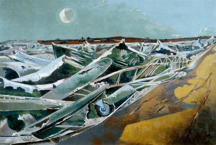
Dead Sea
Background and History of Art Form
- Year of publication for artwork: 1940-1941
- Genre/Style: Landscape Expressionism
- Theme/Series: WWII- Aerial Creatures
- Media/Medium: Oil on Canvas
- Dimension: 102 x 152 cm
- Location of Display: Tate Britain, London, UK
Background and History of Artist
- Full Name/Recognized Name: Paul Nash
- Born Date of Artist: 11th May 1889
- Death Date of Artist: 11th July 1946
- Movement: Surrealism
Brief Overview/History of the Artwork
- Totes Meer (Dead Sea) was painted during the Second World War.
- Nash wanted to title the work using the original German as he intended the picture to be seen by the German people and to reveal the fall and failure of their military attempts to dominate Europe. As such, the work can in a way be viewed as a subtle, patriotic statement in support of the British war effort.
- Nash based this painting on sketches and photographs that he had made and taken at the Metal and Produce Recovery Unit near his Oxford home. He then collaged his collection of images together to create a fragmented sea of battered remnants.
- He particularly wanted to represent German planes (as opposed to the British ones occupying most of the recovery unit) so as to illustrate the fate of the “hundreds and hundreds of flying creatures which invaded these shores”.
- Paradoxically, the inclusion of the moon in the background of Totes Meer adds “incongruous beauty” to the painting and in typical Nash style, suggests the unwavering power of nature, in spite of man’s atrocities.
- The landscape beyond the broken sea of planes suggests that salvation remains a possibility and that the destruction, though horrific, is not total.
- Kenneth Clark called Totes Meer “the best war picture so far”, and this is an opinion still held by many.

Analysis of the Colors/Theme
So we are welcomed to a depiction of a dead sea in World War II in Germany. Because this image is so revered by many it makes me nervous to study its colors, but with the gravity of the situation in Europe as of 2023, I will use my platform to bring color and vibrance in dark times.
Starting with our Polo Blue is the shimmer and glimmer of the sliver that we see in the planes of the Dead Sea. Such a light blue as this which was supposed to be silver represented the new in the painting. What new? Well, it is open up to interpretation. It could be new beginnings in the world as Germany’s failed attempts to take Europe resulted in a change in the world. It could be new beginnings for Germany and also Nash himself. This polo blue could also be seen in the background where the moon lies towards the upper portion of the painting. One could even say that the moon could be a New Moon which adds to the meaning of the color itself.
Next in the sequence, we are greeted by a deep Nile Blue. This Nile blue is the bridge between Polo blue and Nandor green which is the next color in the palette sequence. Nile Blue can be seen at the tips of the polo blue silvers and next to the deepness of Nandor. We appreciate this color in the palettes because it brings out more of the rust of the green and the shimmer of the polo blues.
Thirdly we are greeted to Nandor green which is the color that we see the most in this color palette. It is representative of the rust of the planers which is equivalent to the failure of Germany’s occupation of Europe. Nash wanted this color to communicate failure, failure, and more failure and that is why the entire image is littered with this deep Nandor green. The rust in the green also represents time and success and I use these terms together because throughout time we see the success of the United Powers and what their success brought the world, yet still it is rust to it represents both the good and bad of that success. One can even assume that the lighter parts of green that are seen in the painting are representative of unity and peace.
Lastly, we are greeted by the brown/gold of the image Reef Gold. Now one may think that it is a graveyard of planes of course it would have notes of brown in there, but if Nash wanted to make it Dead Sea why not cover the entire painting in Nile and Polo blues and Nandor green? Well, the answer is simple: balance. To balance out the heaviness of the metals and the aging of the rust, Nash added the Reef Gold to ensure that there is balance to the notion of time allowing the painting to be grounded in the past. By doing that he makes Totes Meer a reflection of the past and a timeless painting.

Personal Viewpoint on the Artwork.
After going over the colors of the painting and interpreting the colors and their representations I have gained a greater appreciation for the painting itself and the efforts of the artist. We have traveled back in time to the depiction of the dead sea of rust that Nash wanted to show us and my is it a sight for the eyes. I thoroughly enjoyed selecting the colors for this palette because at first when I looked at it I thought there wasn’t much going on but when looking it over, there are mixtures of blues, greens, and silver. All colors make Totes Meer what it is, a dead sea of failures and successes.
References
https://en.wikipedia.org/wiki/Totes_Meer
https://www.wikiart.org/en/paul-nash/totes-meer-1941
Next in Set A: The Jazz Band | Gerard Sekoto (1961)

Leave a comment