Originally: 1024 Farben
Background and History of Art Form
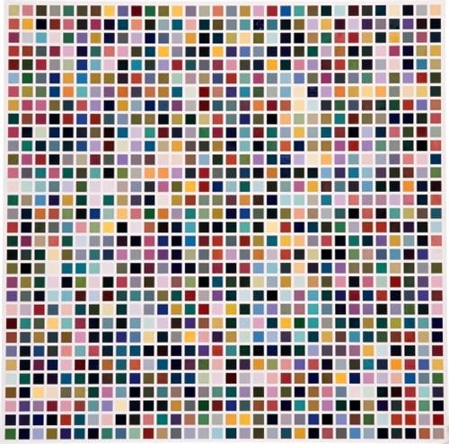
- Year of publication for artwork: 1973
- Genre/Style: Abstract Conceptual Art
- Media/Medium: Oil on Canvas
- Dimension: 299 x 299 cm (117.7 in x 117.7 in)
- Location of Display: Kunstmuseen Krefeld, Krefeld, Germany
Background and History of Artist
- Full Name/Recognized Name: Gerhard Richter
- Nationality: German
- Born Date of Artist: 9th February 1932
- Art Movement(s): New European Painting, Abstract
- Genre/Fields: Photography, Painting
Brief Overview/History of the Artwork
- 1024 colors (1973) is one of Richter’s well-known color chart paintings, which he began producing in the late 1960s. They were inspired by the commercial color charts found in hardware stores. Here, the different colors have no particular meaning or significance.
- Even though the painting mimics a commercial color chart, the colors are not grouped in the same order. Instead, the painting was created through a predetermined mathematical system, and the colors were distributed at random across the grid. The white lines that form the grid are equally spaced, and each color occupies equal space within the painting.
- This kind of distribution points to indifference and meaninglessness: it is part of the artist’s premise that it is impossible to combine colors in a meaningful way.
- The earliest versions of Richter’s color chart paintings were relatively simple, like Ten Colors (1966) and Color Chart (1966). By the 1970s, Richter developed the concept and created more massive and more complex color chart paintings and prints, among them 1024 colors.
- Richter’s color chart paintings were born out of a creative standstill the artist experienced during the late 1960s.
- Because the artist found that he was drained of ideas for his figurative paintings, he began creating imageless paintings. In this way, Richter rejected his prior work while continuing to create new artworks – his color chart paintings, reflecting his feelings of emptiness and his disenchantment with his earlier works.
- At the same time, it opened Richter to the exploration of pure color and form. Richter introduced abstraction to his paintings, while still following his primary method and artistic principal. He believed that the plight of the modern artist was his inability to create new paintings without relying on other pre-arranged structures.
Analysis of the Colors/Theme
With a vibrant and colorful painting of 1024 Colours, we have to look at the individual colors as they are. Their relatability is not conveyed through meaning but through feeling and how the heart and mind connect with that color. For many people, their most comforting colors (which are also the colors that would be their favorite) would be the colors they would see first. For example, the colors green and blue are the first colors to catch my eye in their color chart specifically the brighter and teal blues along with the dark greens. So when doing this analysis, we will focus on each individual color and its feeling so let’s get into it.

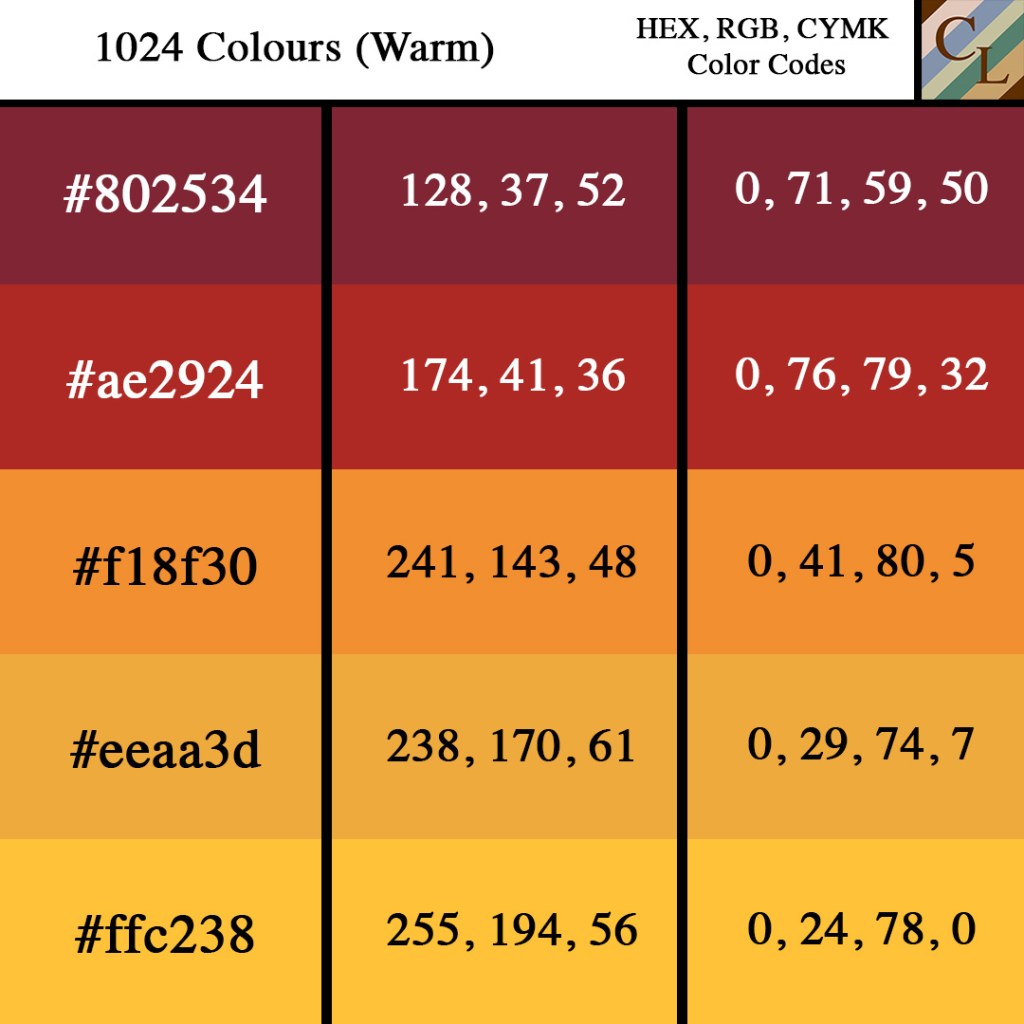
From the Warm Color Palette
- Crown of Thorns, a deep and dark red. Reminiscent of blood and the name has connections to the crucifixion of Christ. I mean it is quite beautiful how the irony of the name of the color and the color itself lines up so perfectly together.
- Mexican Red, a shallow red with undertones of orange. Reminiscent of the red in the Mexican flag or even the hotness of red chili peppers.
- Carrot Orange, simply a beautiful mixture between the color Carrot and Orange, similar to any type of drink with this name, and also the fruit and vegetable.
- Tulip Tree, a shallow orange color with undertones of yellow. Similar to and reminiscent of the color of tulips.
- And Sunglow, a dull but beautiful shade of yellow. Similar to the yellow that would be seen in a sunset, sunrise, or simply the glow of the sun.

From the Cool Color Palette
- Butterfly Bush, a staple color of purple, almost falling onto the pastel side of the color style. If there was going to be a color for a bush surrounded by butterflies, this is a good one.
- Congress Blue, a deep blue. Reminiscent of the ocean or a blue commonly associated with congress or the idea of democracy.
- Fountain Blue, a lighter blue, similar to the blue of water that comes out of a fountain. This color would also be the one selected when choosing what color to paint the inside of the fountain.
- Casal, this dull and pastel-like green reminds me of the beautiful and shallow waters of some Caribbean or Polynesians islands, the very shallow part of fresh water bays.
- And Dingley, this is a swamp-like green. It kind of reminds me of the green sickness of germs. Not the best thing to think of when looking at this color, but please tell me if this color reminds you of something else.
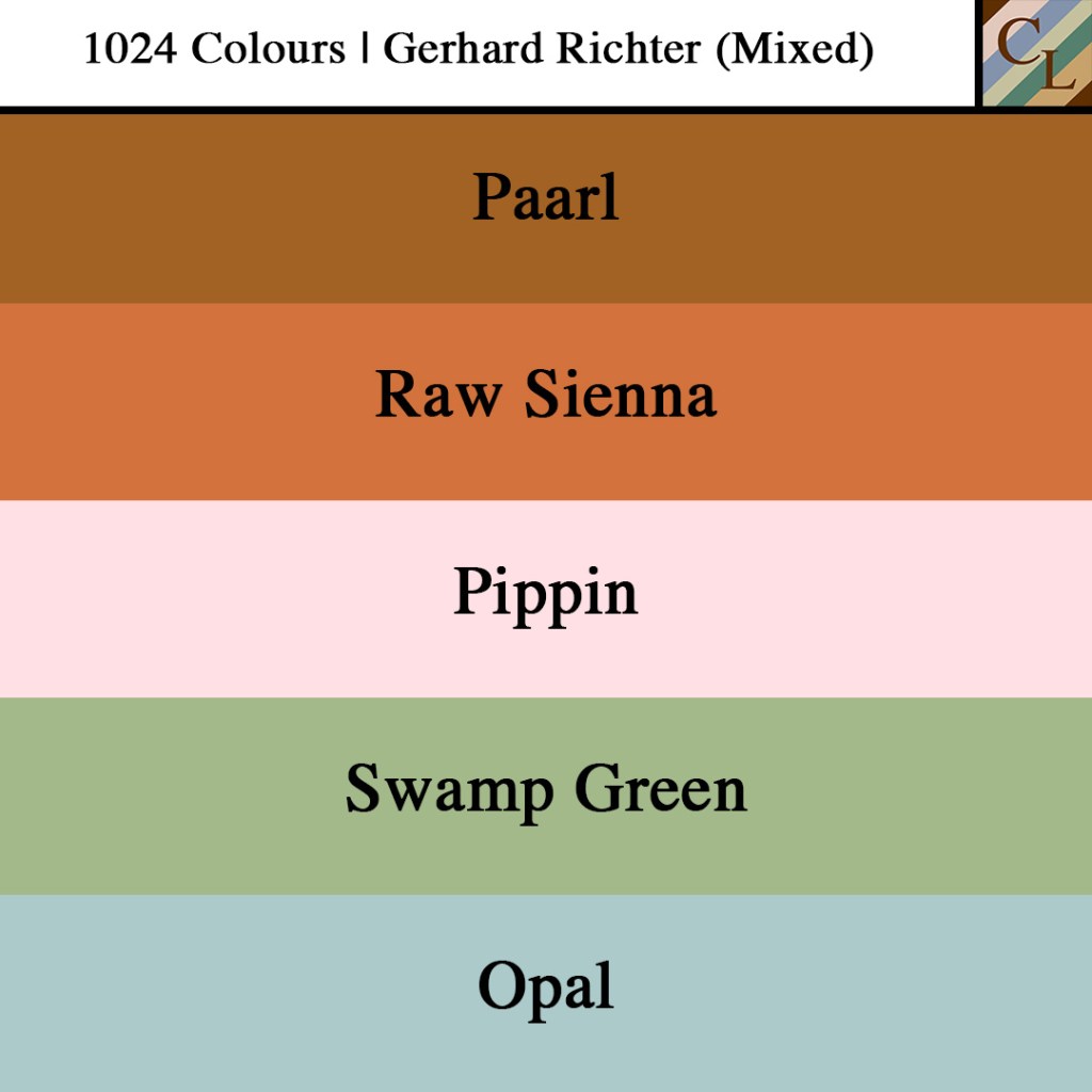
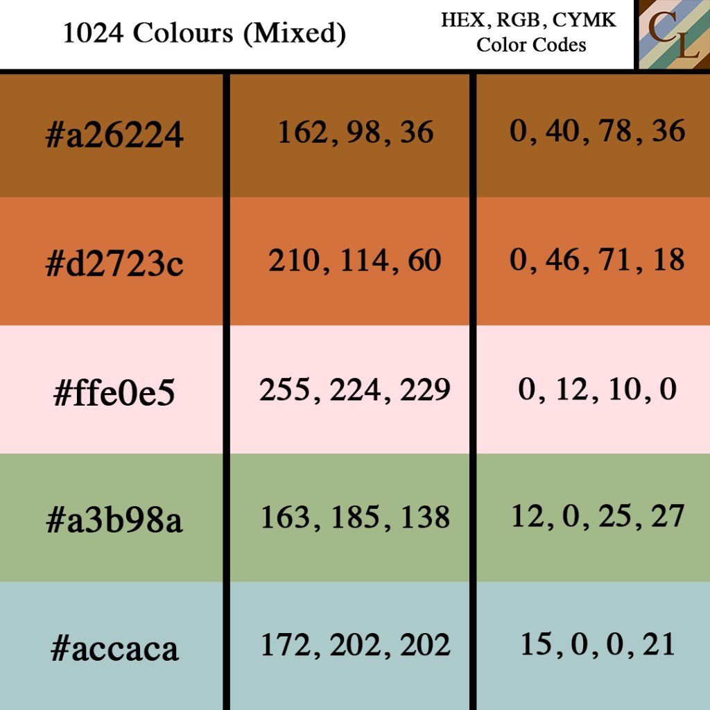
From the Mixed Color Palette
- Paarl, So for this color palette, the first color that I wanted was something that was neither perceived as warm nor cool, so this welcomes in the brown of the name Paarl. Because it is brown, it grounds the palette and can easily connect with the other colors if separated into pairs.
- Raw Sienna is the next color in this color palette which is connected to orange which is a warm color. This color reminds me of the fall season and one of the shades that leave a can turn when they begin to fall, it also reminds me of pumpkin colors.
- Pippin is a beautiful light pink that can uplift the palette with its lightness. This color also introduces the other two lighter colors of the palette. When I picked out the color for Pippin, I began looking at more pastel colors. Pastel colors seem to be some of my favorite color styles and I am glad that I was able to highlight that in one of these palettes.
- Swamp Green is different from the Dingley that we saw earlier. This swamp green is more like a pastel swamp green and is lighter than any of the other greens that we have seen so far. This lightness being connected to the other dark greens is what makes this color pop.
- And Opal, is a light, dull pastel color. This color conjoined with the other two light colors is able to uplift the palette by matching with the Swamp green and creating a cool tone at the bottom portion of the color palette.

Personal Viewpoint on the Artwork.
Whew, all in all, I thoroughly enjoyed looking at these palettes. I liked how even though I picked them all out to be different they all have some way of coming back to each other and interconnecting again. Personally, I didn’t want to speak for the colors, I mainly wanted the colors to speak for themselves. The names, shapes, and hues of the colors all speak for themselves; it was up to me as the presenter to showcase the beauty of these colors and simply tell you what they remind me of and how I connect to these colors. Richter was able to see the endless possibilities for color theorists and artists when looking at this image. One of the great things about this image is that you can create multiple palettes from its being. I hope that you all were able to connect to these colors in some way shade or hue and please enjoy the wonders of 1024 Colours.
References:
https://www.wikiart.org/en/gerhard-richter/1024-colours-1973

Leave a comment