Background and History of Art Form
- Year of publication for artwork: 2003
- Genre/Style: Symbolic Expressionism, Surrealism
- Media/Medium: Pastel on Paper
- Dimension: 160 X 120 cm (63 in x 47 in)
- Location of Display: Tate Gallery
Background and History of Artist
- Full Name/Recognized Name: Paula Rego
- Nationality: British, Portuguese
- Born Date of Artist: January 26, 1935
- Movement(s): Expressionism, Feminist Art
- Field of expertise: Painting, Printmaking, Sculpture
Brief Overview/History of the Artwork & Notes on Color
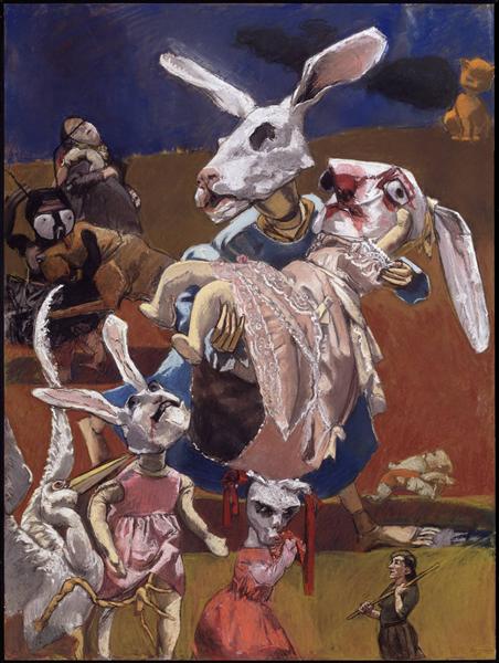
- War 2003 is a large pastel work on paper, mounted on aluminum.
- The image is dominated by two rabbit-headed figures in the center, the larger one of which wears a blue dress and carries the smaller, who wears a frilly pink dress, has bloody marks around its eyes and mouth, and whose legs and arms resemble those of a soft toy.
- Behind these two figures on the left-hand side of the composition is an ant-like figure grappling with a brown hound, and a pelican embracing a woman.
- In the foreground stands a row of four figures: a stork with outstretched wings who has a talon inside the pink dress of another rabbit-headed figure, and a creature in a red dress with ribbons tied to its head glaring at a diminutive woman in soldier’s dress.
- A lifeless child or toy lying on the ground by the central pair, and a sitting cat in the top right-hand corner, add to the ominous ambiguity of the scene.
- The background of the work is divided into three blocks of colour – yellow at the bottom, muddy terracotta in the middle and a foreboding dark blue at the top containing a plume of black. These bands of colour retain traces of Rego’s sketchy mark making, in contrast to the figures, which are more heavily worked and consequently opaquer.
Analysis of the Colors/Theme
This ominous image is a lot to get through, but as we can see the reds and blue dominate this painting as its depiction of the name War cries throughout the images that we see in this painting. I want to do a color analysis of this image justice because of how it connects to the current time with the wars that are happening in Eastern Europe and the Middle East. So with that being said, let us get into this breakdown starting with the color
East Bay, which is represented in the upper portion of the image, and the blue of the main figure that stands in the foreground. Usually, we are greeted by blue meaning communication and hope yet in this image it represents isolation as the only figure in blue caries what looks like their dead compatriot or innocent bystander. We say this because the contrast between the blues and the pink of the main figure speaks volumes with the red being the main focus power in the central message of the image. And what is that message? Based on the dead that we see in the blue figures, I can only imagine that it means abandoning all hope and entering the realm of isolation.
Moving on to the next color which is a deep Nutmeg red. When I look at this color and what is it connected to it sends chills down my spine. We see this Nutmeg red in the blood of the main figure being held by the blue figure and in the mischievous figure with the ribbons on. It may be my imagination running wild but I can imagine that figure holding a heart in their hand, the heart of who? I only see one dead person in this image, maybe there is a story here after all. This Nutmeg red is a communicative color throughout the image and it reveals one of the many messages behind this painting, death behind war.
Next, we are greeted with a Chestnut orange and we can see the vibrance of this in the middle portion of the image and the colorfulness of the mischievous figure’s dress. Such a strange coincidence, however, that the color nearest to the red of the figure’s ribbons is nutmeg (a fellow nut) and chestnut is the closest to their dress. I think unknowingly Rego this with the intention that this figure is the main villain of this piece. There is much going on in this painting, but when we focus on only the evil figure, we get this overwhelming sense of the chills that this image conveys. When we focus on the scene that is happening in the middle background, we see that heartache and death follow the figures as they embrace what they lost and prepare for the oncoming battle or the end of all times.
Lastly, we are greeted by a neutral and calming Swirl which can be seen in the bunny rabbit figures and the pelican at the bottom of the image. These may be obvious colors for the animals yet when we take a look from a different perspective, we see hope over heartache. What I mean by this equation is that even though we can look at the white in these figures and see peace or hope, it will forever be tainted by the death that follows the colors Nutmeg and Chestnut in this painting. The color Swirl, in this color palette, will forever be haunted by the mischievous figure and deadly colors that is connected to.

Personal Viewpoint on the Artwork.
Overall, I hope that I did justice when trying to connect the colors I found to the many meanings and interpretations this image can take on. In the end, with a title being War it will always have a timeless appeal to it because we as humanity are creatures that have tainted our history with war resulting in heartbreak and terror spread throughout the world. I like this artwork because it is open to multiple interpretations and I hope my interpretation opens your eyes to an aspect of life that you never thought of before. Until next time…
References:
https://www.wikiart.org/en/paula-rego/war-2003

Leave a comment